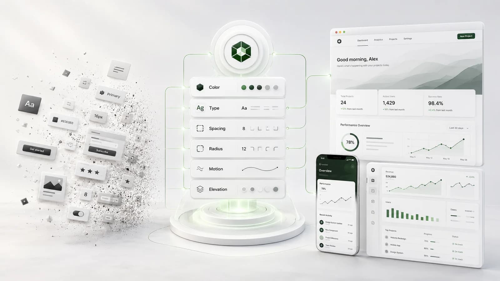
When people hear "design tokens" they think of a designer-and-engineer convenience: a tidy list of colours and spacings. That undersells it. A token is a decision with a name and a single home — and once your decisions have names, you can change what your company looks like without a redesign.
Hard-coded values are debt
A colour pasted into two hundred components is two hundred future edits. A colour referenced as a token is one edit. Multiply that across type, spacing, radius, motion, and elevation, and the "design system" stops being a style guide and becomes leverage: the ability to move the whole product at once.
One source of truth, two outputs
We author identity as tokens from day one, then drive the marketing site and the product from the same source. Change a token once and the brand and the app move together — which is how a system survives two years of growth without anyone calling for a rebrand.
The test of a system is not how it looks at launch. It is how it absorbs the screens you have not designed yet.